

Longview IOT
BACKGROUND
Client:
Carnegie Technologies, Inc. Internal Product
Request:
Carnegie Technologies had already put together a partial platform consisting of a web application for presenting and parsing data captured by LoRa-based sensors for a variety of industrial and commercial implementations. I came onboard to review and improve usability and information architecture issues and to design additional features needed in order to meet the established business requirements.
Challenges:
Two years of work had been done by the previous team, but everything from the information architecture to the business strategy had serious issues at a fundamental level.
Usability and hierarchy issues were prevalent throughout the existing design, causing difficulty with maintaining consistency within the UI and user flow.
The business was struggling with the sunk cost fallacy that we needed to continue fixing a design that was flawed at its core instead of taking what we learned and building a new foundation.
The business continuously injected new requirements into the prioritization queue before meeting the original MVP requirements.
UX Audit
It didn’t take long to understand that the existing design of the Longview application suffered from a laundry list of fundamental architectural and usability issues resulting from lack of adequate design processes and vetting. One of my earliest tasks was to perform a UX audit to determine a series of short and long term considerations to address in order to improve functionality.
Short term suggestions from the audit included:
Implement a more consistent use of color
Remove “functional controls” from navigation menu to prevent buttons from performing double duty
Implement button states, globally
Improve accessibility issues by using icons and shapes instead of relying solely on color
Redesign visual treatment of items on the map in order to prevent visual noise and overlap
Long term suggestions from the audit included:
Research how the application would be used on mobile platforms and reduce functionality as needed for mobile
Adjust information hierarchy to nest functionality and sections in a more logical manner
Fix navigation structure to improve user understanding of “location” within the application
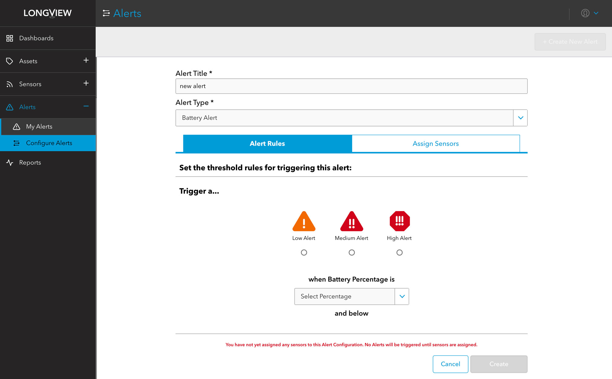
More robust alert handling and management
Consider building a new version from scratch to address fundamental information architecture and structural issues within the application
Integrating with the team
Stepping into a project that has already been underway for a couple of years presented plenty of challenges. But working with the team, we slowly implemented better design and development processes and defined the critical areas of the application that needed further refinement. I focused on finding ways to address the information architecture gaps while implementing a workshop process for providing new requested functionality.
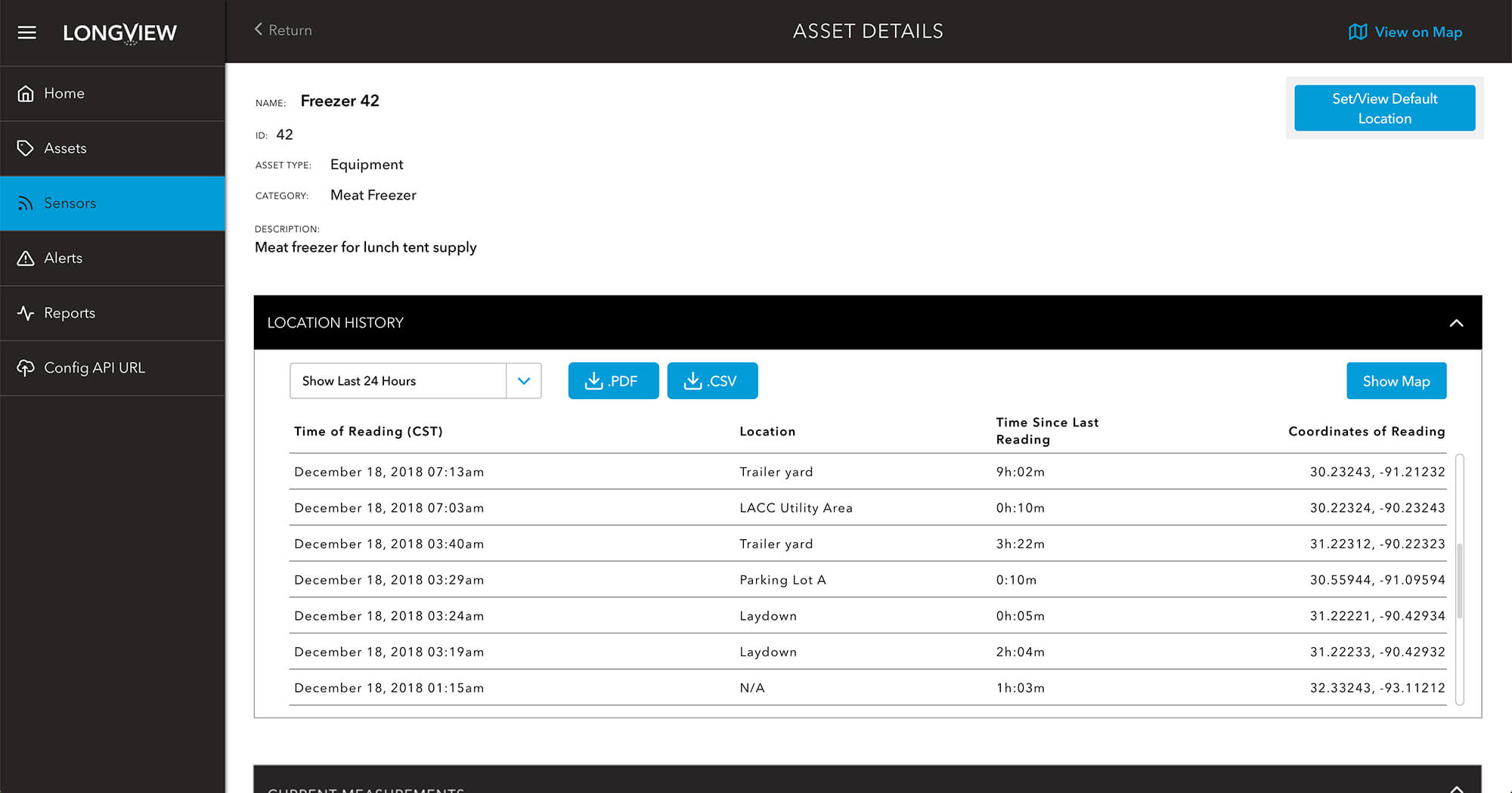
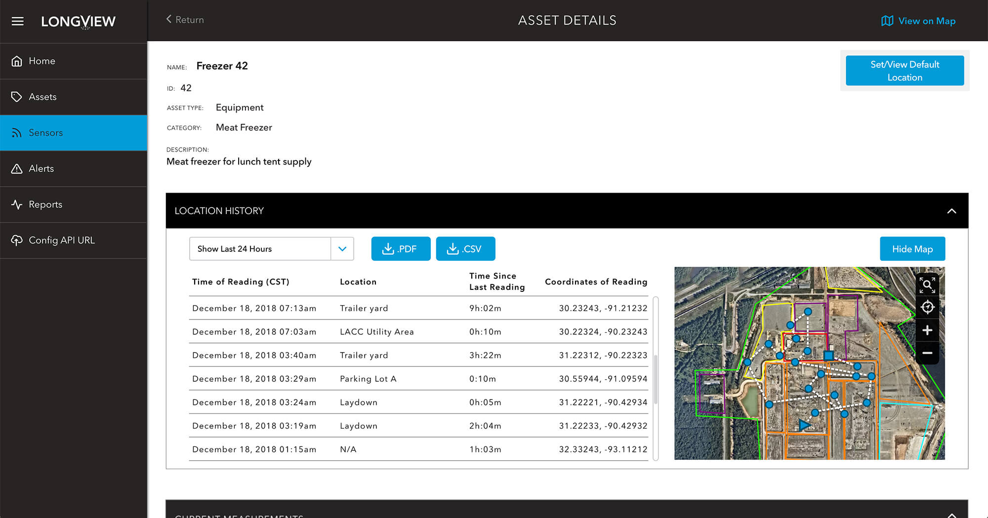
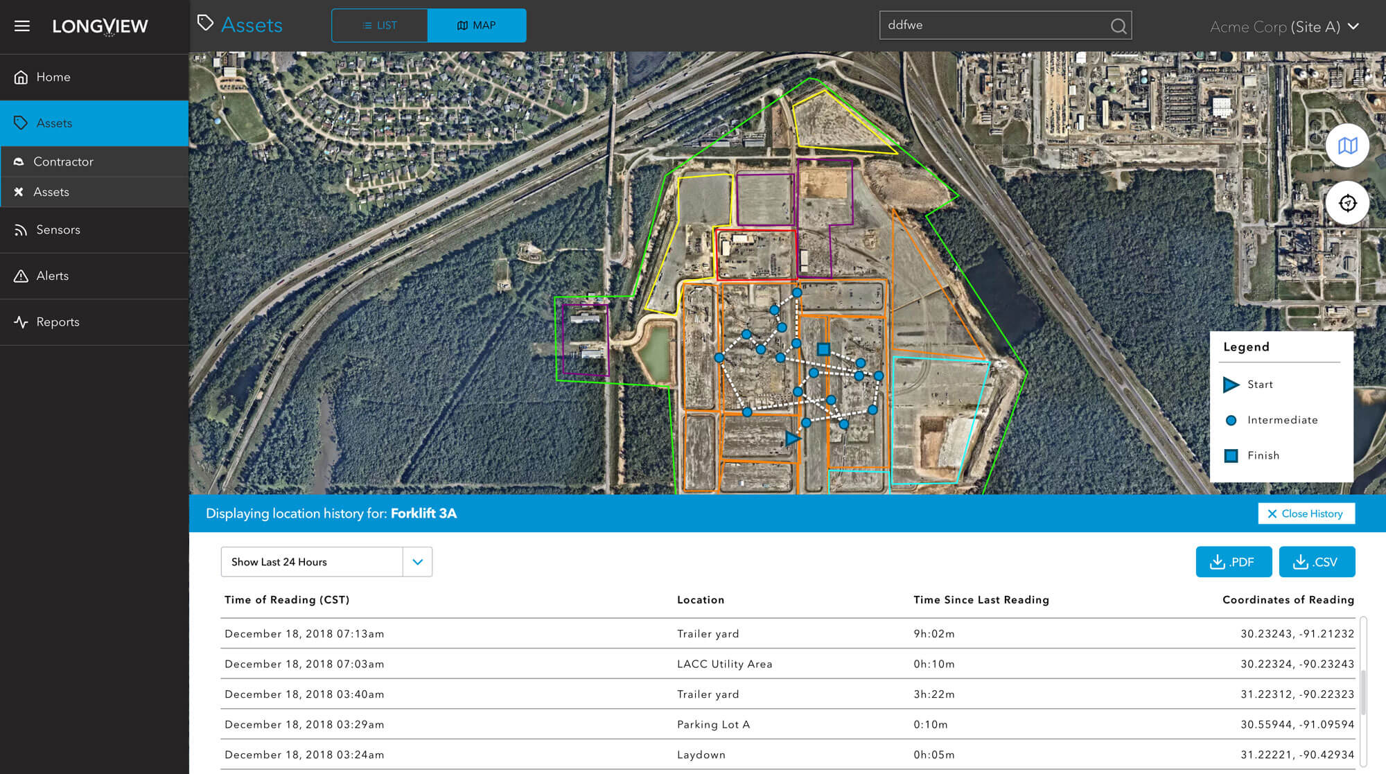
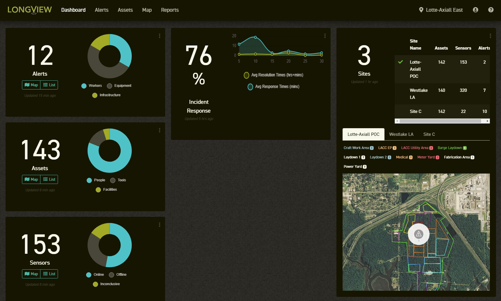
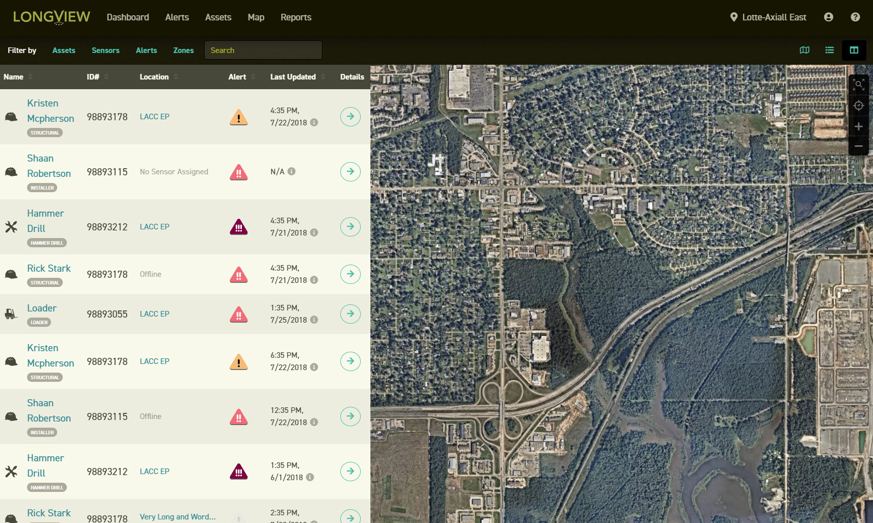
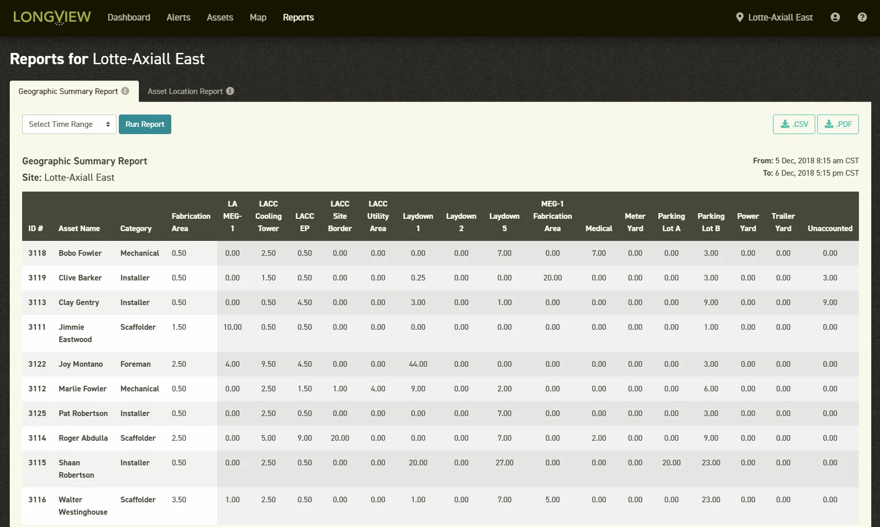
Location History Interface
To allow users the ability to view historical information for sensors used for tracking assets both as a table and within a map, several interfaces were designed. These allowed the location history to be accessed from the Details pages, both in tabular view and as a historical track on a map. A design was also created to allow this view directly from the Map view.
Functional requirements included:
Ability to set a time bracket for the history.
Ability to view the track on the map.
Ability to download reports.
Ability to view the time of reading, the location of reading, and coordinates.
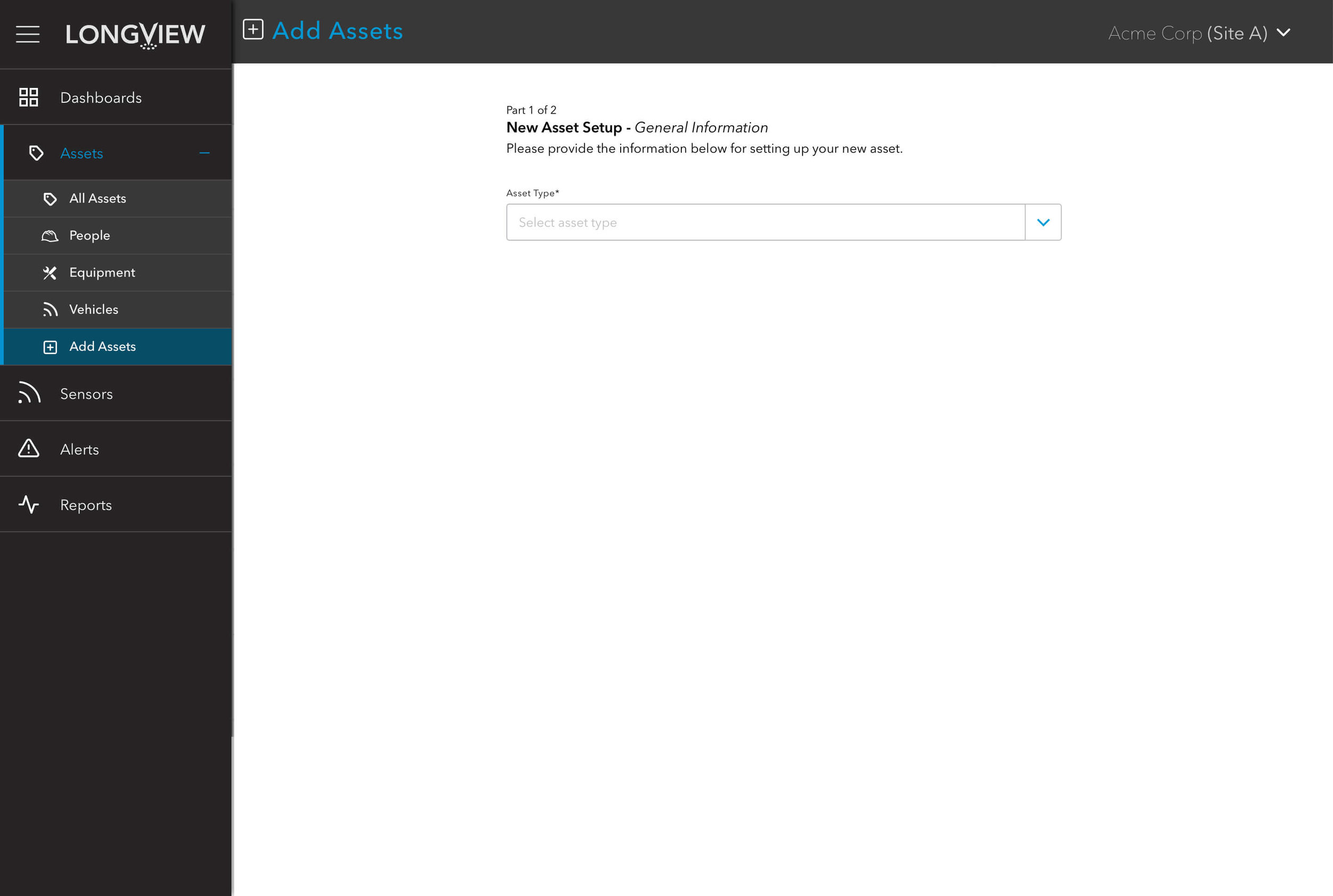
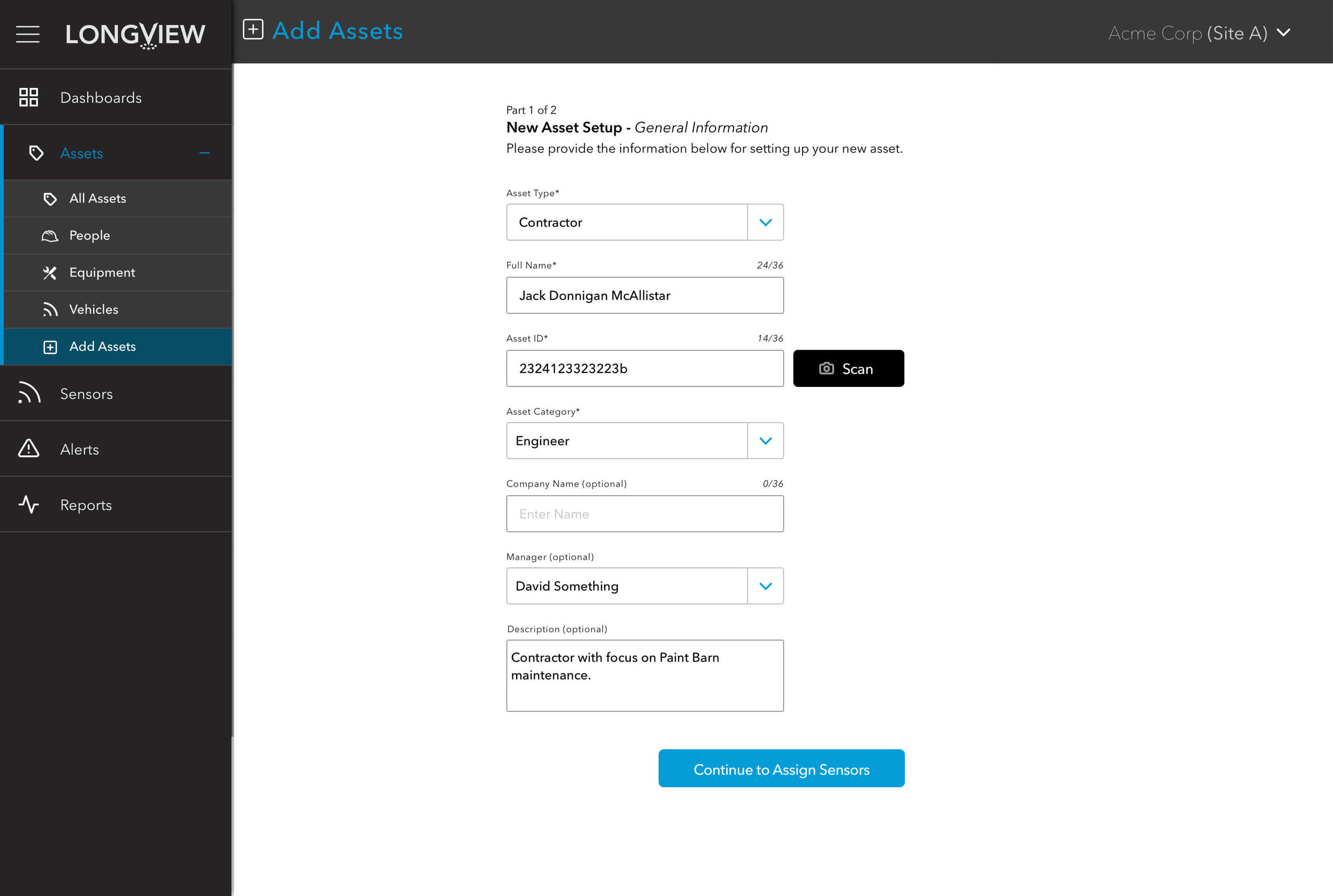
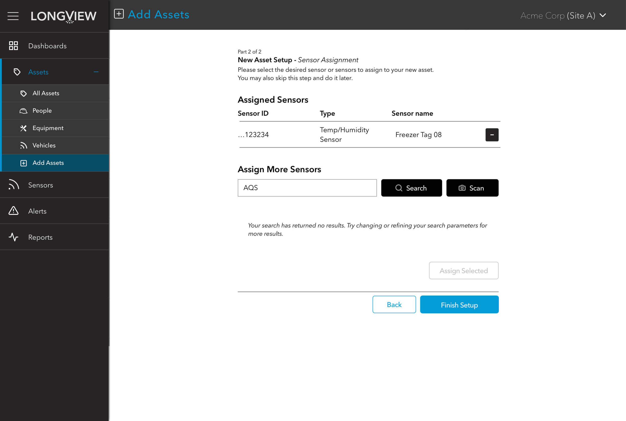
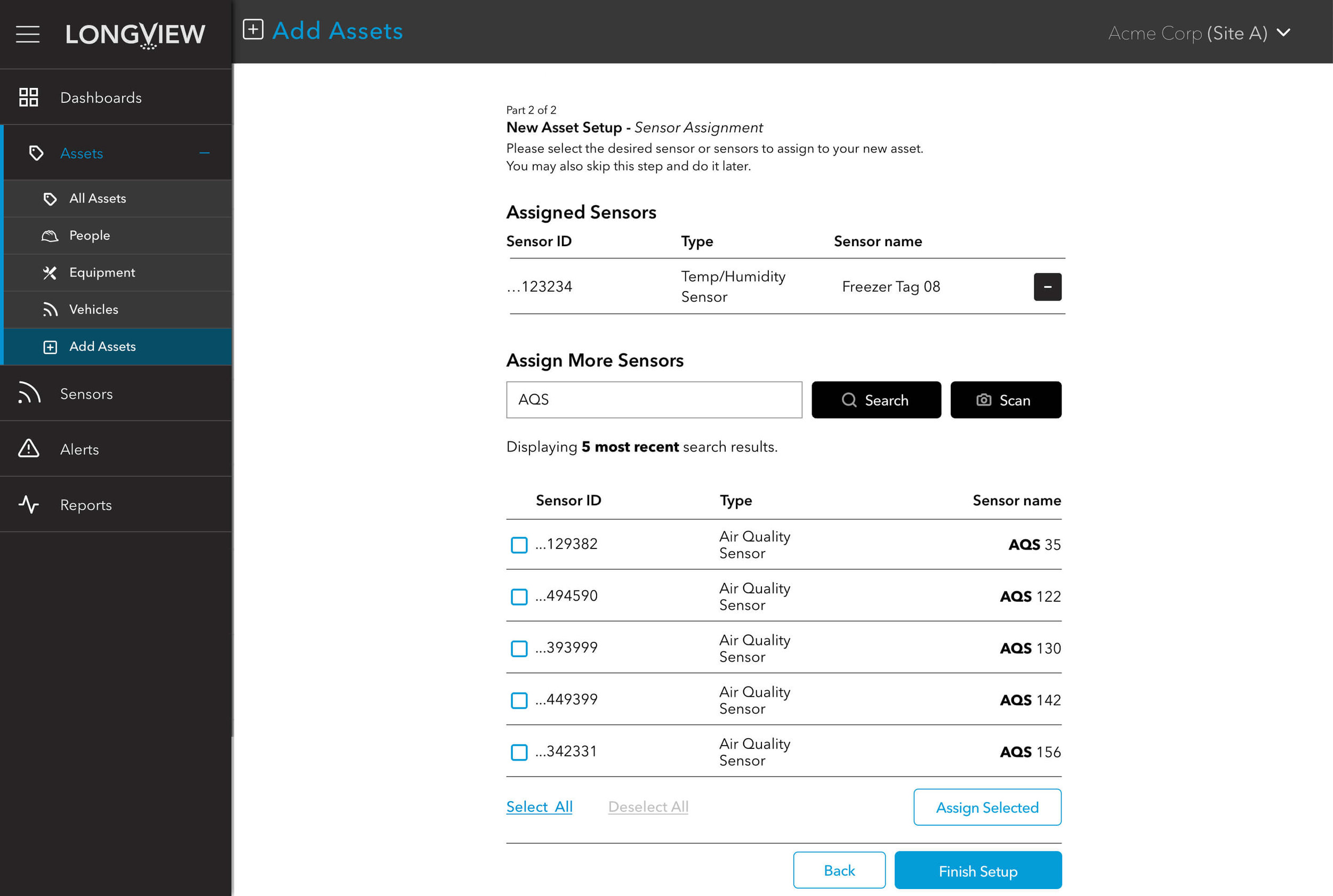
Creating “Assets”
Users needed to the ability to create “assets” to which sensors can be attached. Until completion of the interface and workflow, the backend development team had to manually create assets. A lot of thought was put into the order of operations in order to prevent the user from making invalid choices while maintaining the flexibility to skip optional entries.
Steps shown include:
Selecting an asset category
Entering necessary information
Selecting sensors to assign
Editing selected sensors
Completion toast/ready to create more

An opportunity reveals itself


Finally, the UX team was given the opportunity to put some of its methodologies to good use in order to define the priorities for finalizing the first version of the application. I designed and ran a series of workshops with various team members in order to collect all the tasks needed for completion. These were then grouped into Affinity Clusters to categorize them before having the team assist in an Importance/Difficulty Matrix activity. This collaborative environment helped the team understand the scope of what remained and provided interdisciplinary understanding of how tasks were prioritized and why.

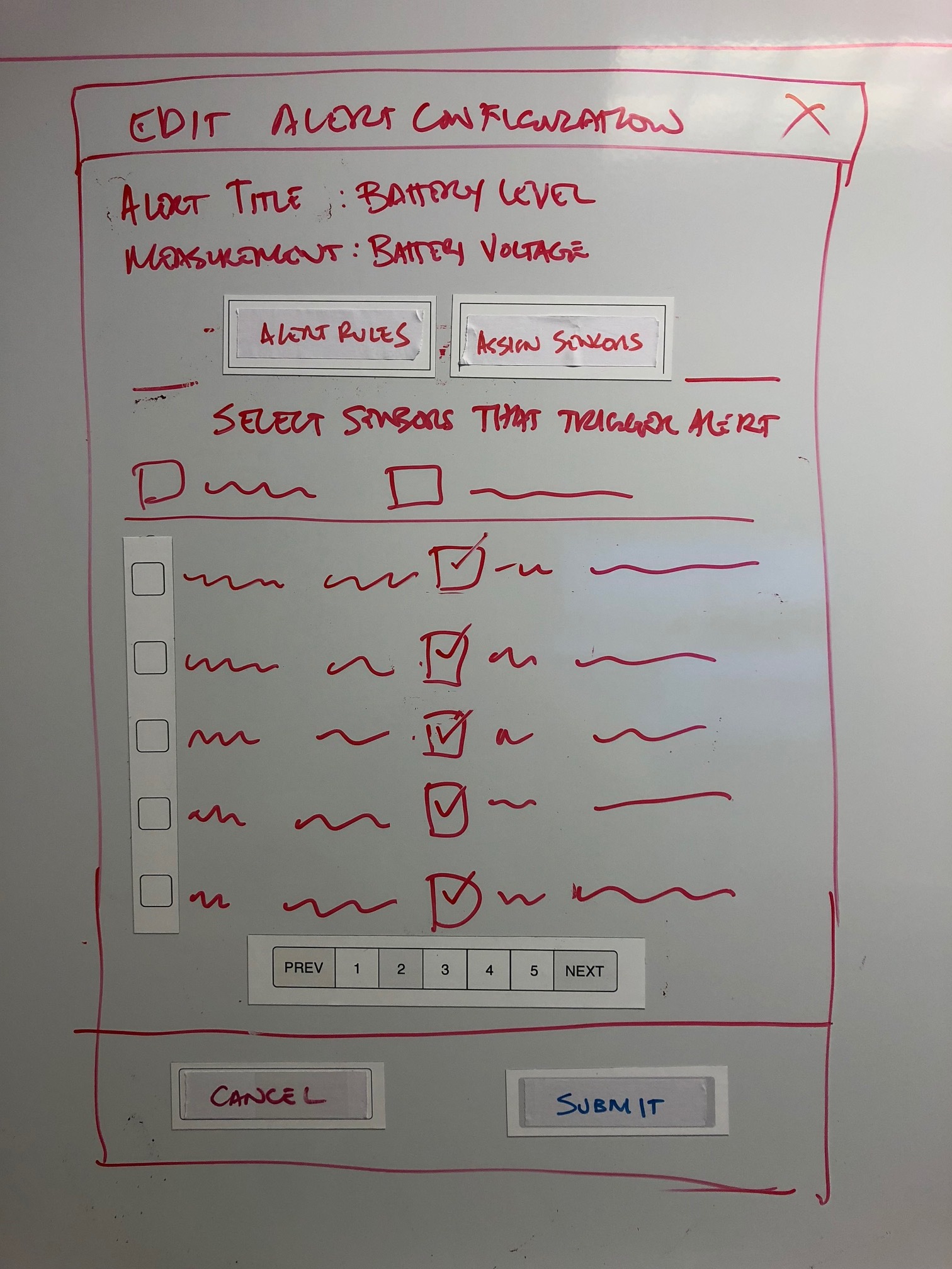
Increasing Agility
I also took it upon myself to address the workflow issues with the team. I knew that we needed to move away from waterfall on a project of this scale, so I began working with the team to introduce a more agile process. To that end, I created a set of magnetic whiteboard “components” that could be used for quickly augmenting sketched interfaces. A component library was created so that the development team could move from whiteboard wireframes straight to using the components for creating quick prototypes that could then be rapidly iterated.
Building with Components
Working with the dev team, several elements within the old version of the application were finally converted into components, defined through the work on the whiteboard wireframes. New interface designs were quickly developed, built from said components, initially as prototypes, then refined through UX and QA testing to ensure functionality, usability, error validation, and warning feedback were thoroughly considered.

RESULTS
Though I was not at Carnegie through the finalization of the Longview application, significant headway was made on implementing functionality required to meet the defined requirements. Along the way, I helped to implement several new processes focused on removing the need for extensive documentation in favor of stronger collaboration, visibility, accountability, and ownership across a previously siloed team. I also identified several areas outside of the application itself that had not been considered in terms of the customer journey, including online hardware/software sales, customer support cycles, and end-of-life.
My Role: UX Product Design Lead
Design Team:
Thomas Brady (UX Team Lead)
Mick Santostefano (Prototype Design/Coding)
Nathan Dominguez (Design/Wireframe Production Support)
Client: Carnegie Technologies, Inc. Internal Product
Responsibilities:
User Experience Strategy
Creative Direction
Process Design
Requirements Documentation
UI Design
Postscript: A Prototype
Early on, In an effort to try and guide the rest of the organization toward redirecting efforts toward a new design paradigm, we threw together a quick interactive prototype (based on the existing assumptions and requirements, which I made clear should be reevaluated).
Not only was the visual design updated to be more modern and legible, we also proposed heavy reorganization of the information architecture with the heavy caveat that this was a conceptual approach based on questionable assumptions, but would at least provide a more marketable and usable application for users.
Though the leadership team did appreciate the cleaner design, they were reluctant to stop work on the original version, and, sadly, the prototype direction was shelved.