
USAA Investments Storefront

Background
Client:
USAA Investment Services Company
Request:
In 2019, USAA sold off its investment portfolio to Charles Schwab and Victory Capital, Inc. This necessitated an overhaul of USAA’s business strategy as well as its web presence in order to inform members of the change in services. Our team was tasked with working with the business partners charged with the website overhaul, resulting in a new, simplified, streamlined information architecture that attempted to balance the requirements of three separate financial entities.
Challenges:
Balancing the sheer number of stakeholders involved, not just from USAA, but from Schwab and Victory Capital, Inc.
Heavily siloed environment both between business and design as well as between design and other production teams.
Business team seems inexperienced at effective requirements gathering and definition.
Extremely dated technology. The CMS used for USAA Storefront work is only marginally responsive and relies on fixed width layouts.
USAA control processes include heavy legal and compliance involvement (because it’s a financial institution) as well as intense accessibility and design guidelines.
Discovery
I came onto the design team just as the project was starting to coalesce. In the short period of a month, I had to find my bearings around USAA, it’s product lines within the Life Company, the Investments business, and the storefront experience itself. The experience had to launch within 8 months of my start date, so our team needed to understand the requirements as quickly as possible.
UX audit
My first step with any redesign is almost always a UX audit of the existing experience. Though the structure of the Investments portion of USAA.com would undoubtedly be entirely different due to the divestiture of the business, I still spent time exploring what would be replaced in order to understand USAA’s web design philosophy and how the organization put forth its content strategy.
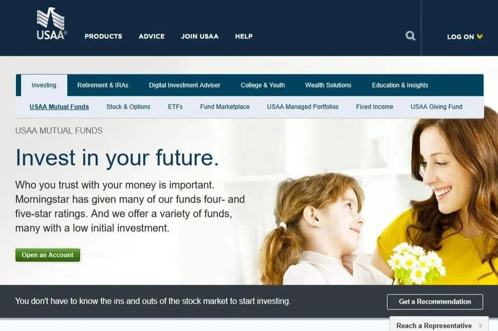
Original USAA Investments homepage
Learnings from the audit:
Nearly every page within the legacy ecosystem had its own layout and approach.
Navigation often led to dead ends with no clear way to return to the root Investments page.
The navigation menu was a hierarchical mess, split into two levels that often belied the actual relationships. Some items were nested within others and others were at the same level with seemingly little rhyme or reason.
The design language applied to the legacy pages was often inconsistent and contained interactive elements that looked static and static elements that looked interactive.
Suggested strategies for the redesign:
Create page templates for pages serving similar purposes.
Ensure that users are always provided clear paths to prior areas of the site structure.
Ensure a clear hierarchy of pages and page nesting with clear relationships between parent and child content.
Apply a design language which includes consistency in use of color, layout, content strategy, and hierarchy.
Integrating with the team
Integrating with the design team was fairly straightforward, but breaking through silos between design, our business partners, our content team, and development teams proved more difficult. USAA, even by its own admission, suffers from silos resulting from decades of institutional inertia. Where other organizations have attempted to integrate production teams, USAA’s production teams still function along completely separate tracks. In order to mitigate this, we attempted to redefine the boundaries to set up the proper iteration expectations with our business partners while organizing stronger communication and hand-off procedures with our production teams.
Concept design
Based on findings from the discussions with business stakeholders, it was clear that the entire site needed to be updated to shift away from a storefront that guided users directly into sign-up and purchasing flows to preparing users to understand the new relationship with Charles Schwab. This included setting the correct expectations about the relationship in addition to educational information customers might need to get started with investment portfolios.

Site map diagram of the new information architecture
A new architecture
The former information architecture of the Investments structure needed a full rework, not just because of the changes to the USAA business model, but also to address hierarchical issues and needless complexity reflected in the primary, secondary, and tertiary navigation elements.
I did the initial legwork to clean up the IA as well as the navigation menu system, then worked with USAA’s IA consultation team to confirm the final structure. The result is pages nesting in a much more logical structure and a highly simplified navigation interface.
Primary navigation paradigm
One of our early challenges involved developing the primary navigation paradigm for the site structure. The team already had preconceptions about how the navigation should work including by member need or by presenting the two providers organized with their corresponding products. I suspected that the most logical approach would be instead to present members a list of clearly labeled products, instead.
The design team strongly suggested a round of user testing based on these three paradigms. We arranged a series of general and member-based prototype tests leveraging InVision and UserZoom to measure efficacy and preference.

Wireframe v. 1 - Navigation by user intention.
Wireframe v. 2 - Navigation by partnership and products.
Wireframe v. 3 - Navigation by product lines.
With the data backing up the product-based approach as the most efficient and understandable navigation pattern out of those we investigated, we were able to achieve alignment across the team as to the path forward.
Design production
With testing complete and with a clear data-driven approach in place, I went ahead with refining the homepage design and created templates for the product detail pages. From there, the production process mainly focused on working with business to decide on content strategy and adapting the designs and templates to the needs of that strategy. Along the way, however, there were still challenges to navigate.
Managing quality
I was surprised to find no formal quality‑management process at USAA. Our project management software couldn’t capture all internal and stakeholder feedback, and the weekly review cycle left little time for thorough issue resolution.
To fix this, I built an Excel tracker (shared on Box) that replicated Jira’s core functions and scheduled a full QA pass before every release. The new system cut missed issues to near zero and gave us clear visibility into each feature’s status.
The launch
After navigating a hectic review and control process, the site launched on schedule with only a handful of release notes.
The launch was largely successful. The pages were designed to inform members about USAA’s upcoming divestiture of its investment business and to guide them to the appropriate provider for specific products.
Two months after go‑live, data showed an 11.5 % conversion rate of visitors who had arrived at Schwab.com via our portal.
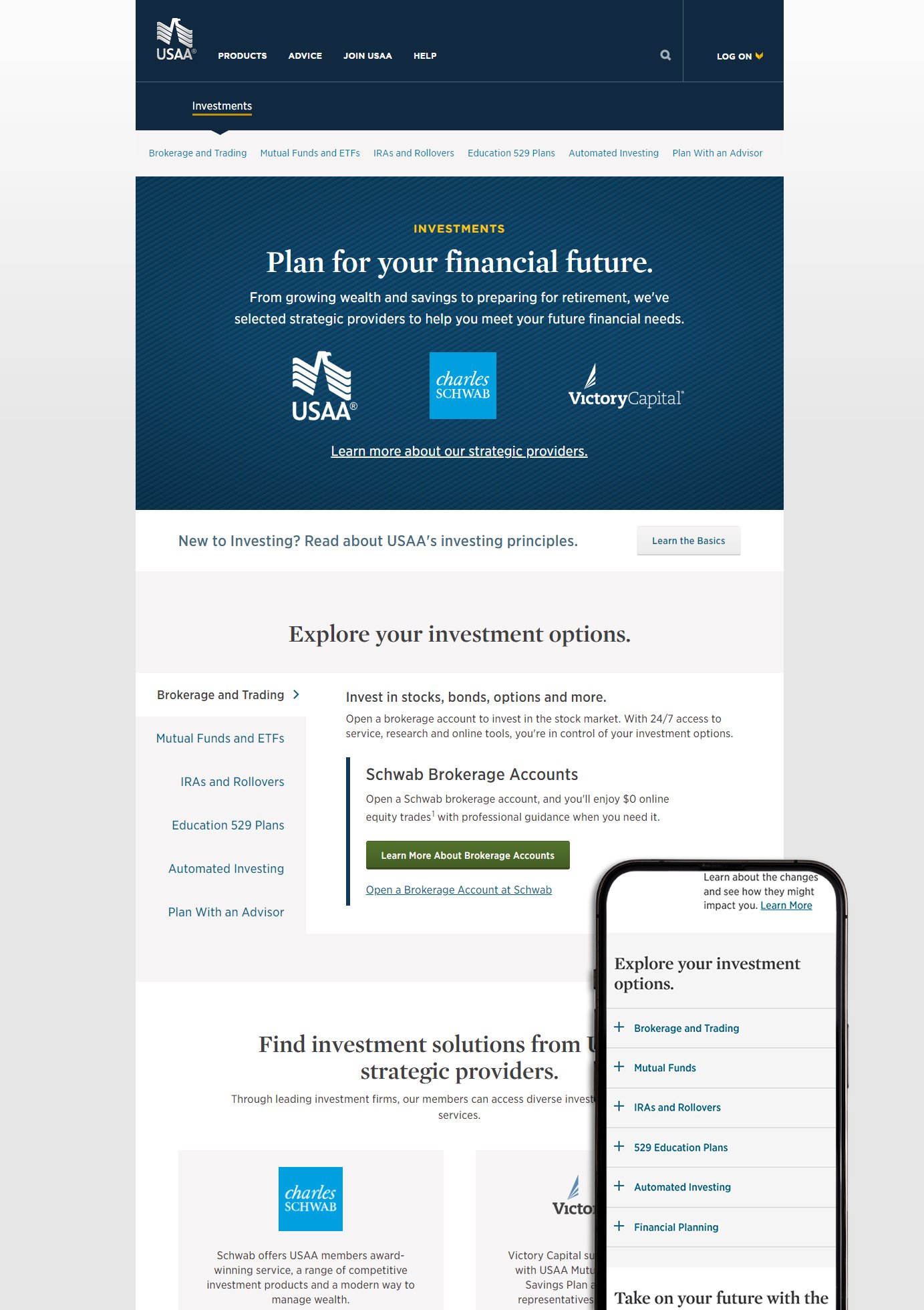
USAA Investments Home Page
Results
We delivered almost 30 web pages on schedule despite weak initial specs and constant scope changes. Facing a large, siloed stakeholder group across three orgs, unclear goals, legacy tech, and overburdened review teams, we survived by tightening our process, aligning closely with production, and leveraging skilled producers on both design and digital sides. We’re now analyzing analytics to uncover further optimization opportunities.
My Role: UX and Design Lead
Production Team:
Martin Davis (Director)
Benaz Meyer (Lead Producer)
Andrew Ried (Digital Project Manager)
Sinjin Hilaski (Content Writer)
Client: USAA Financial Advice and Solutions Group Internal Project
Responsibilities:
User Experience Strategy
Creative Direction
Process Design
User Testing
Requirements Documentation
UI Design