
USAA Deferred Annuity Calculator
Background
Client:
USAA Life Servicing
Request:
In order to help customers understand their annuities options, USAA had a Fixed Guaranteed Growth Annuity Calculator available on the website that had been designed a decade ago using some version of the prior design language. With the shift to the new design language and tech platform, the calculator needed to be redesigned.
Challenges:
The existing calculator was built entirely as a front-end service, which resulted in static results. It was requested that the new one hook into a back-end API that could adjust results based on market data.
The prior calculator had several usability and accessibility issues that needed to be addressed.
The partners were not entirely clear about the requirements at the outset of the project.
UX audit
Our team performed a usability audit on the original calculator to determine where the greatest opportunities lay.
Learnings from the audit:
The instructions for the calculator were lengthy and unclear, likely leading to confusion for some users.
Sliders had been implemented in order for users to set amounts. However, sliders are often finicky to use accurately, especially when increments are small and the range is large. They also pose difficulties for users with mobility challenges.
The calculator had also been launched at a time when USAA’s website barely supported different viewport widths so it was not responsive.
Suggested strategies for the redesign:
Simplify the experience as much as possible.
Avoid non-accessible components.
Avoid non-responsive layouts.
As much as possible, prevent users from generating errors.
Existing calculator experience
Redesign process
Although the audit already provided us with many avenues toward improvement, the design team wanted to ensure we defined any other opportunities that the prior design hadn’t accounted for. We met with our business stakeholders and subject matter experts in an effort to understand the end user goals as well as to establish any specific business requirements before starting on concept exploration.
Exploring ideas
Once the initial requirements were captured and we felt we had a solid handle on the scope of the work, the designer started exploring concepts. We iterated through several rounds of wireframes, first with internal design team feedback. Later rounds were shown to partners and further refined based on tech limitations and stakeholder input.
Wireframe v. 1
Wireframe v. 3
Wireframe v. 5
Guerilla testing
Once we had a general layout and flow that partners approved of, we ran some guerilla testing with some other employees in order to understand user preferences between some low risk interaction options which helped us to finalize the ultimate approach.
Finalizing the design
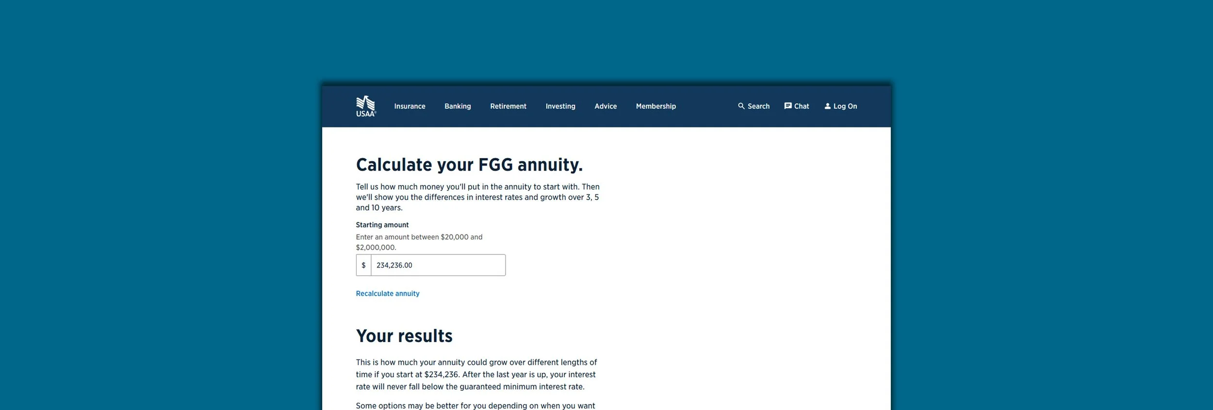
With the collected stakeholder feedback and testing completed, we settled on a final design approach. We simplified the numerical entry to a single field that loaded in the final calculations and product options below. The user could then edit and recalculate by editing their entry in the field, easily.
Final design including desktop and mobile web layouts.
Design QA
Our typical QA process requires another designer on our team to review the work in preparation for our organization’s design control review. Defects are recorded and then re-reviewed for adequate completion before being sent to the design control review. Defects found during the control review are addressed in a similar fashion.
Developer handoff
After fixing all design defects and adding accessibility markup, I asked the developers to involve the design team in their demos so we could verify alignment with our comps. During the build, designers joined each demo, offering feedback to keep the final experience as close to the intended design as possible.
Results
Analytics collected the months after launch showed that the changes we implemented resulted in:
Click through rate into the application flows increased by more than 10x (.3% to over 3%)
Bounce rate dropped by nearly 83% (22.1% to 3.8%)
The results were even more impactful than expected and showed the value of structured design thinking. Despite this, we will be watching the analytics closely to see where additional opportunities might arise for future improvements.
My Role: Design Lead/Creative Director
Production Team:
Tim Stackhouse (Director)
Leslie McGarrah (Lead Producer)
Hunter Peterek (Designer)
Dane Arbizu (Digital Project Manager)
Client: USAA Life Company Internal Project
Responsibilities:
User experience strategy
Creative direction
Process design
User testing
Requirements documentation
Stakeholder coordination